
Branding 101 | The 22 Immutable Laws of Branding | Part 1
April 23, 2013
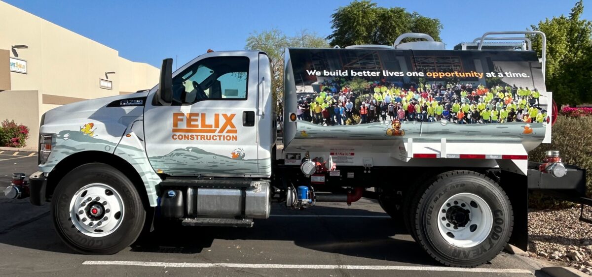
What Gets Noticed on a Vehicle Wrap?
October 3, 2013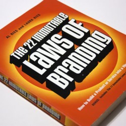
Branding 101 | The 22 Immutable Laws of Branding | Part two

Marketing and branding experts Al Reis and Jack Trout published their first ideas on the “Immutable Laws” back in 1972 in a series of articles for Ad Age magazine. They then proceeded to write a book titled “The 22 Immutable Laws of Marketing”. Later, in the 1990’s Al Reis went into business with his daughter and they co-wrote “The 22 Immutable Laws of Branding”
The books are very interesting reading and I highly recommend them for anyone who owns their own business. In our first post on the subject, we discussed the first two laws; the law of expansion and the law of contraction. In this post we’re going to look at laws 16 & 17: The law of shape, and the law of color.
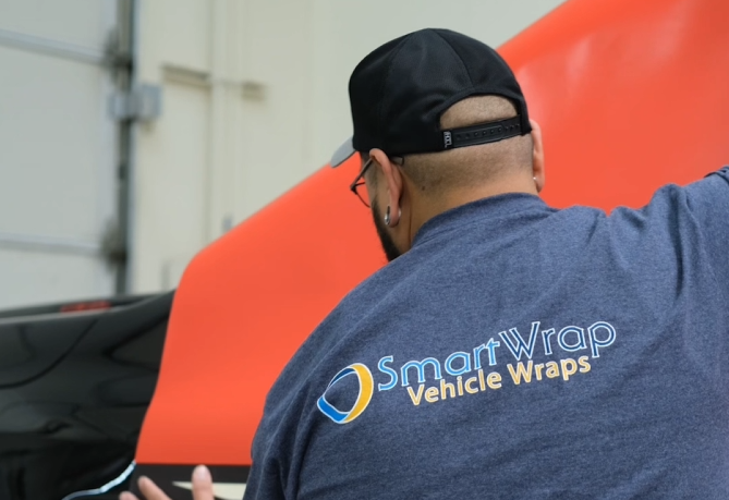
Both of these laws are highly relevant to what we do here at SmartWrap. At SmartWrap we design and install vehicle wraps. Our clients are mainly small to medium sized business looking to enhance their brand. Our clients usually fall into one of two categories: Either they are just starting out and they need to create the impression in the public eye that they are an established brand…OR…they are an established brand that has outgrown their original image and they need to design something to catch up. With that in mind, lets take a look at the law of shape and the law of color.
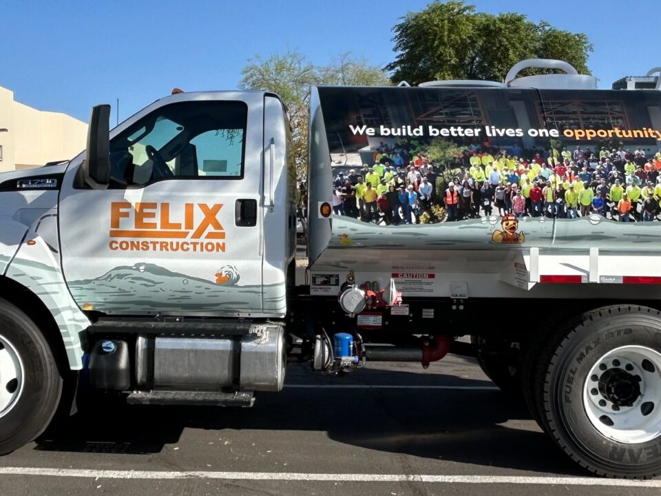
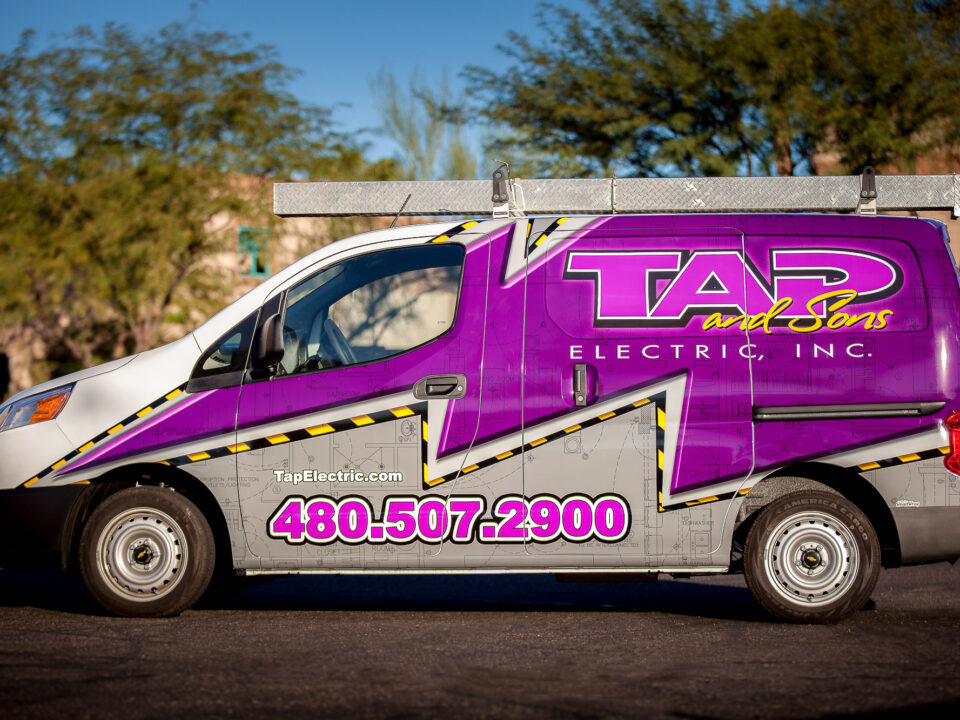
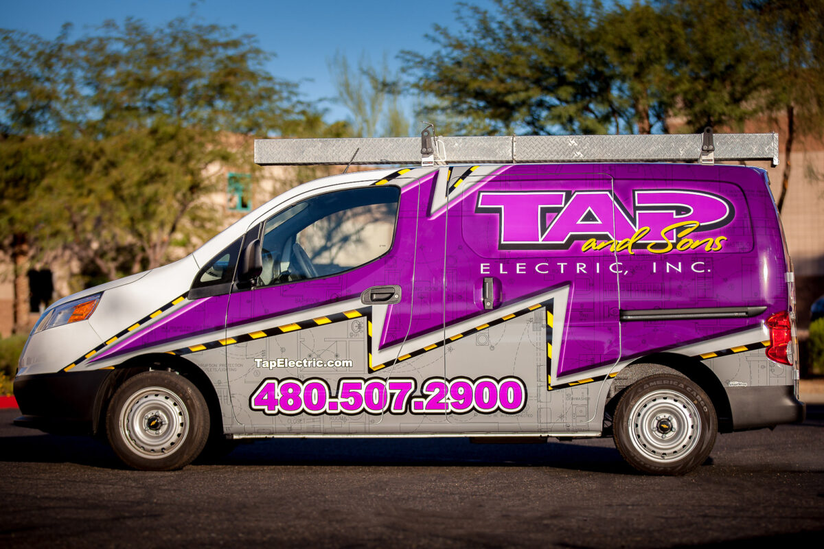
The Law of Shape states: “A brand’s logotype should be designed to fit the eyes. Both eyes… For maximum visual impact, a logotype should have a horizontal shape. The ideal shape is 2 1 /4 units wide by 1 unit high.” This means you should try to keep the shape of your logo wider than it is tall. Just think of driving down the street, and trying to read a tall skinny sign vs. a short wide sign. If the tall skinny shape were effective, you’d probably notice that billboards are shaped that way right? But they’re not. This is extremely relevant to the mobile graphics and advertising world. Most vehicles are the ideal shape. They are longer than they are taller, especially vans and boxy type mini vans like the Scion xB. In addition to the shape of the logo, the type of font that is used is of significant importance. But not in the way you might think. Al Reis says that it does not matter what type of font you use, it matters only that you can read it. He sums it up very well by asking us whether we know what type of font Rolex or Rolls Royce use. We don’t know. And if the font was different, but still easily legible, we wouldn’t think any different. So pick a font that can be easily understood. This is especially true in the vehicle wrap business. The vehicle is a moving billboard, and people have little time to try and figure out what they are reading
The Law of Color states: “A brand should use a color that is the opposite of its major competitor.” Al Reis gives us some big examples; Coke and Pepsi. Coke is red, Pepsi is blue. Hertz is yellow, Avis is red. Futhermore, Al recommends to sticking to five basic colors: Red, orange, yellow, green and blue. Although a combination of colors can be used, it will be more effective and memorable in the mind of the consumer to stick to one color. Just think of UPS = brown. Think of Caterpillar = yellow. Of course there are exceptions that work, take a look at Fedex for example. They use purple and orange. Take a look at McDonald’s, although the predominant color is red, people remember the golden arches. The main point of the law of color is be the opposite of your competition if you want to stand out.
At SmartWrap we believe that a great wrap vehicle wrap design starts with a great logo. Even a great, exciting vehicle wrap will have difficulty overcoming a poorly designed logo, whether it be due to the type being un-readable or the shape or the colors being too similar to the competition. Our own market research backs this up. In a side by side 5 second test only 58% of people remembered the name of a business when it was written in simple black lettering compared to 85% recall when a well designed two color logo was used.