Quick Guide | Photographs for Vehicle Wraps
May 22, 2014
How Too Much Information on Your Vehicle Wrap Could Hurt Business
October 28, 2014What You Need To Know About Vehicle Wraps
Choosing the right vehicle wrap company is an important decision for you and your business. It can be a difficult choice with so many different companies jumping into the “wrap business” these days. Many business owners fail to understand that vehicle wrap design is as important as any of a business’s other marketing and branding efforts. Failing to understand that the days of simply lettering vehicles are gone, and continuing on with less than effective vehicle wrap designs will harm your business.
When people ignore your business name and message because it is visually boring or even worse unprofessional looking, that is a lost opportunity. Add up all the lost opportunities, all the times when a potential client was looking at one of your service vehicles and they ended up not remembering your name, not remembering what you do – that is a huge lost opportunity to connect with a customer. And making a negative impression through poorly designed or unprofessional looking design is even worse because a potential customer might actually remember who you are and feel so poorly about the way your vehicle looked that they will remember and actually AVOID calling you. Properly branded companies are worth so much more than “no name” brands. Not only when it comes time to sell the business and retire, but also while still in business.
Where do you want to be in 3 or 5 years? What type of customer are you trying to attract?
Just think about Starbucks for a minute. How is it that they can charge $3 or $4 for a cup of coffee and be lined up out the door every morning?! Especially when McDonald’s sells coffee for $1 or less. Speaking of McDonald’s, how is it that they are the #1 fast food restaurant every year? In 2012 McDonald’s sales were 3 times that of the #2 restaurant chain, Subway. In fact, McDonald’s sales were over 4 billion dollars more than Subway, Starbucks and Wendy’s combined! A little side note: At SmartWrap we are huge fans of McDonald’s and the systems they’ve developed. Our ownership and management staff have over 30 years franchise experience with McDonald’s and we’ve often recalled our experiences there to improve SmartWrap’s systems.

So how is it that some companies are so different from others? How is it that some companies are so much more valuable than others, that some companies charge more and earn more and completely dominate the market? The answer: Effective Branding.
So what is effective when it comes to vehicle wrap design?
We will get to the nuts and bolts later in this article, but for now the answer is: That depends on what the goal is. Where do you want to be in a year? Where do you want to be in 3 or 5 years? What are you doing to meet those goals. What type of customer are you trying to attract? What type of customer are you not trying to attract? Some clients have been surprised that we ask about these sorts of things.
Having a plan of where you want to go is absolutely crucial.
“What does this have to do with my vehicle graphics?” they ask. Or “Just design me something, you don’t need to know all about my business” At first we found these types of statements stunning. But instead of just leaving it at that and “just designing something” we do what comes natural to us. Ask more questions. We take the approach that people have hired us to design not to be yes men who lead a customer right off a branding cliff. In asking more questions we’ve discovered that the apprehension or confusion a client feels is because they don’t actually have specific business plans. It’s difficult enough for a lot of small businesses to service the clients they have and try to make a living without having to write up lofty business plans. And have them bound at office max with a great title page as if they were going to present them to the board of directors in a down town office. In fact, nobody is going to read those plans. But that doesn’t make having a plan unimportant. Even if you as the business owner are the only one that ever reads it, having a plan – a road map of where you want to go is absolutely crucial. Without this map, it will be much more difficult to reach your destination. Without this map it will be confusing trying to decide what your logo should look like, what services you should or shouldn’t offer, who your ideal customers are and which marketing messages to go with in order to attract those ideal customers. And the company you choose and trust to create your vehicle graphics better understand all of this otherwise you are going to waste a lot more money than just the amount you spent on the wraps.
Before we dig deep into elements of great vehicle wrap design its critical that we meet two of the greatest marketing and branding experts that have ever lived. The wealth of knowledge and experience that these two gentleman has been invaluable to me personally as well as to SmartWrap and it’s design processes. Reading up on Al Reis and David Ogilvy will give any business owner some valuable insight and direction.
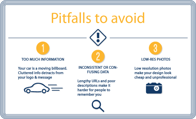
Last time, what is effective vehicle wrap design? While vehicle wrap design uses many of the elements of other marketing media, there are some crucial differences that can’t be ignored. So in talking about what makes great design lets talk about pitfalls to avoid

1: too much information
The vehicle is a moving. Unlike print, internet or television, the person looking at the vehicle has a limited ability to digest the information. Think of it as a billboard as you drive by.
Think of all the billboards you’ve seen. What are they about? What are the visual aspects and what are the words you see? Invariably billboards are about the brand. Not about the features and benefits of a product or service. Think of a Budweiser billboard. You don’t see the nutritional content up on the billboard. All you see are the things that Budweiser hopes will elicit a favorable impression from someone who is likely to drink beer. Think of a McDonald’s billboard: A big picture of one or two food items and several words of copy.
The problem that most service based businesses who want to do vehicle wraps run into is too much information. The business owner has a difficult time limiting what it is they do. For example a home repair company will want to list all of the different kinds of home repairs they do from bathrooms, kitchens, living rooms, plumbing, windows, electrical, tile, cabinets, windows, pool repair. By the time their list of services is complete their vehicle wrap resembles a renaissance era proclamation on a giant scroll. There is no way anyone is going to digest all that information. And worse, they will be distracted from the company name. This means wasting money. This means losing potential clients. Another common mistake is made by contractors who list “commercial” and “residential” on their vehicles. So that means you work for everyone right? It’s unnecessary. It similar to Christmas lights in China that have a little warning attached “For indoor or outdoor use only”. If you only do one or the other it will be important to let potential clients know, but if you do both, it’s just one more thing for people to have to read.
2. Inconsistent or confusing information
Inconsistent information can be a result of a tagline that doesn’t make sense for the type of business. For example, you would never suggest a Mortuary have a tag line like “Happiest place on earth!”. Inconsistent information can also be when a company name and their website name are different. For example: ABC Plumbing…visit us on the web at http//www.Arizonasbestchoiceforbplumbingandheatingandcool.com. While we’re on the subject it is unnecessary to include http or WWW with a web address these days. The internet has been around long enough that people know how to find websites. To avoid the clutter of having the same information in different places consider making a simple switch on your vehicle wraps: include .COM right after you business name. For example ABC Plumbing .com
People search for millions of things every day on search engines. People type in the search bar as much information as they can remember about what ever it is they are looking for. Let’s say they saw your company vehicle on the road, what is the single biggest design feature you should include, above all else? Your business name in the form of a readable logo. If people can remember just that one single thing until they are able to type your company name into the search bar then they’ll find your website and therefore, they’ll find your phone number. They’ll also learn about all of the other services you do, and can see photos of your work and read your mission statement. But if you clutter your vehicle up with even just one word of information too much you will run the risk of them not remembering your name. And when they’ll be googling someone else’s name that they did remember instead.
Sometimes people will try to save money on a vehicle wrap by getting more than one business on the wrap. I’ve seen a restaurant and a personal injury lawyer on the same wrap. Are you saying I might need to call Goldberg and Osborne after I eat at your establishment? Sometimes companies will try to get advertising dollars from the product lines they carry. And they end up with everyone else’s logo on their vehicle and no one remembers what all of this is for.
3: Photography
Photographic images can be a major problem. First, if the images themselves are not extremely high resolution, (See our photographic guidelines HERE) then they’ll look terrible and will do harm to your public image. Photographic images that aren’t of a high enough resolution will be “grainy” and pixellated, in other words they’ll look blurry when they’re blown up to the size of a vehicle wrap. Secondly, even if the resolution is acceptable, if the photos are not at a certain level of professionalism they will not represent your brand well. Reflections, bad lighting and bad angles will make the imagery look cheap, not how you want to be thought of right?
Even more important than these two points is the fact that photographic imagery is extremely difficult to incorporate across all of your marketing efforts. Consistency of imagery is extremely important for a business/brand when shaping the impression a potential client might have. If a pool company has generic pictures of water splashes on their business cards, a home owners pool on their brochures, and another image on their vehicles it makes it difficult for the consumer to identify the company quickly.
Another huge mistake companies make is having photographs of the products they sell on their vehicle wraps. This is common in the Air Conditioning field. Their wraps look like random pictures of grey cubes with vents on them, air-conditioners. The simple fact is most people don’t care what the air conditioning unit looks like. The most pressing concern in the mind of a person who needs to choose an Air Conditioning company is “Can I trust this company” A vehicle wrap with pictures of machines and technology most people outside the A/C field don’t recognize is a huge wasted opportunity. Having the logos of all the different brands you carry or service is irrelevant. CAN I TRUST YOU TO FIX MY A/C?? Can I trust you in my house? For women this is HUGE! Studies have shown that 90% of the time it is the woman of the house that has to arrange for contractors to come to the house, and she needs to be there to let them in. She wants to know “Can I trust this company inside my home, with my kids?” They could care less what an A/C unit looks like.
Even if you think about this from a purely strategic stand point: How are you going to differentiate your company from the dozens of other companies out there with pictures of grey cubed shaped machines on them? certainly not by doing the same thing.
So you’re a pool supply or cleaning company. Nothing says clean safe pool water and summer fun with the family like a bunch of pictures of round things, cylinders and domes with pipes and gauges right? wrong. Or a picture of a high end luxury back yard when all you do is weekly pool service. The wrap needs to be consistent with the service or products you supply
So you’re a caterer. Nothing says “Wow I need to hire them” like pictures of unrecognizable plates of food, glistening with grease and washed out under flourescent lights right? Wrong again. Or a picture of a massive catering event on a golf course with huge long tables and tents, when you’re actually a small caterer. You won’t be getting calls for the types of jobs you can handle, and you’ll be spending your time fielding calls for jobs you can’t handle.
So you’re a painter, a remodeler. Nothing says “That looks like a professional company I can trust” Like a collection of photos of workers working on something in someones unfinished house. Totally wrong, again.
Solutions:

Too much information:
Carefully choose what information is critical and what information is nice to have. Eliminate all information which is not critical. Start with your logo/business name. Next, choose the 1 service that you provide that you would absolutely love to have more customers calling about. If you have several services, think of a word that sums all of them up. Next, your tagline and lastly one way to contact you. If you want a really great example of the kind of restraint and discipline I’m talking about take a look at Google’s homepage. Take a look at the login pages of Facebook or any other social media site. There’s an image, and you can login or create an account. That’s it. Transfer that to a vehicle wrap and you have: A logo, minimal back ground or other non photographic design. You have what you do, what your company is about. And you have an option or two to connect, a phone number or a website. For more detail on “Too Much Information” see our article on it here.
Confusing or inconsistent information:
Stick to one company, one idea. Think about who you are and what you want to be known for and summarize that in a very short sentence. If your website is different from your company name then consider changing the website. At the very least leave that confusion off of your vehicle and go with your phone number instead. Make sure your tag line is appropriate for the type of business you’re in. Make sure it’s memorable and different. “Your one stop shop”, “one call does it all” are used by so many businesses out there that these tag lines are meaningless. If you don’t have a good tagline, then don’t put it on your wrap.
Photography:
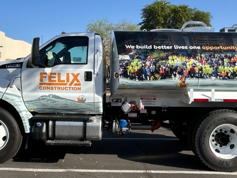
Limit images to professionally produced high resolution photographs. (See our helpful photographic image guidelines here). At SmartWrap we prefer not to use photography. Why? Photographs contain a lot of detail, which if you think about a moving target like a vehicle wrap – will distract a potential client from remembering the most important details of all. Your business name and what you do. But if you insist on photographic images just make sure that they are of an advertising agency quality. Badly lit, blurry and weird looking photography will lose you potential clients really fast.
Tim Hilcove
Google


